
How to work with a graphic designer

As you can probably tell by now, things are looking a little different here. Last month was my first anniversary of working in Melbourne, as both a freelancer & an employee. Most of the time, we are so focused on the next goal, that we don’t reflect on how far we’ve come. For the first time in my life, I feel like I’m in the right track, and the right place to grow. Rebranding is one of my 2019 resolutions. For the past few years, I’ve been playing with Adobe trying to create a logo that suits me and my work. And as much as I love typography, fonts and lettering, I have finally come to realise ⏤ sometimes you just have to let the professionals do the work (another lesson I’ve learned from last year). The talented Ann Chang seriously made my visions came true, and I want to take you guys through the process. Why? First, I want to document this journey (and you are all part of this). Second, it’s fun!
上週在社群平台分享了新的LOGO,這是我第一次正式跟平面設計師合作,真的有一種相見恨晚的感覺。四月,是我在墨爾本開工的一週年,不管是正職、攝影接案跟部落格都是。一年下來,有比想像中困難的地方,當然也有沒想到自己能完成的工作。很多時候,我們急於朝目標前進,會忘了停下腳步看看自己走了多遠,拍拍肩膀,對自己說聲 — 「很棒!辛苦了!」 在擬定2019 RESOLUTION 的時候,REBRANDING 就是其中一項。過去,我總嘗試要自己用軟體設計,但怎麼看怎麼不順眼。我是一個喜歡什麼事情都自己來的人,總要掌控一切,個性很好強,覺得求助就是失敗(哪來的歪理,我知道)。但進入職場後,發現每個人有每個人擅長的部分,有時候適時的放手讓別人去做,各司其職,成果會比想像中好許多。簡單來說就是「相信專業」啦(笑)所以呢,在這次重新設計 LOGO 的部分,我交給關注已久的 ANN CHANG;同時就把這個有趣過程與你們分享,順便讓有這方面需求的人了解一下,跟自由接案人怎麼合作最有效率也最合適。

@annchangdesign

@annchangdesign
RESEARCH
I’d like to think to find a designer that suits you & your brand is like finding the perfect pair of heels for your big day. For example, it doesn’t make sense reaching out to someone who’s known for colourful & bold designs when you are more of a minimal, back & white kind of girl. Don’t forget to look into their personal work portfolio, because you’ll get an idea of what they enjoy doing the most. I’ve been following Ann for a while, and most of her work online really spoke to me. When I find myself going back to her portfolio all the time during my search for graphic designers, I soon realised — she’s THE GIRL.
找到對的平面設計師,就跟找一雙好鞋一樣(不是貶義唷,我是非常重視鞋子的人,標準鞋控)。做功課絕對必要,要事先了解心儀設計師的風格,再接著想想跟自己或是品牌合不合適。舉例來說,你的設計師擅長的是童趣且色彩繽紛的設計,或是帶點普普風,但偏偏你喜歡的是強而有力的黑白極簡線條,這就有點不合邏輯(當然也有例外的,有些平面設計師喜歡挑戰)。另外,除了看設計師與不同客戶的合作,也非常建議去看看他們的個人作品集,因為這樣才能知道,再不受限的情況下,對方是怎麼將腦海中天馬行空的想法轉化成眼前的成品的。以我的情況來說,光是找設計師就花了三個月的時間,存了很多資料,也持續關注他們新的作品。本來想要找墨爾本當地的,想說見面好溝通些,但找來找去,最後都還是會連到 ANN 的 INSTAGRAM 帳號(笑)。加上她慣用的配色與字體也都是我自己平常提案會用到的類型,覺得不找她太不合理,就放棄了找澳洲設計師的堅持。

moodboard
The three things (other than the legal stuff) I never shoot without are mood boards, brand briefs and a shot list. I need to know the two parties are on the same page before we start working together. Same goes to working with graphic designers. I gave Ann my brief and Pinterest Board I’ve been working on for months before actually reaching out to her. It’s important that the visual and texts speak to each other, and always state CLEARLY what you like and don’t like. For instance, my brief to Ann was — Strong but not bold. Feminine but not girly. It’s simple, short, but on point. In return, she gave me a really clear schedule on her process and the price I would be expecting. And now, we are all set to start designing!
我自己以攝影師身份與人合作的時候,拍攝之前一定要先拿到三樣素材(不包含合作條款和合約):圖像範例、照片清單以及文字敘述(品牌或個人的故事、風格等等,讓我能更了解整體的方向都好)。而這個模式,在與平面設計師合作也適用(其實任何跟影像有關案子的都行)。得到 ANN 確認想合作的意願後,我把先前製作好的 PINTEREST MOOD BOARD (圖像範例)與個人風格簡述傳給她。在送出這兩個提案素材前,必須先確定他們的風格是相似的,不用完全一模一樣,但至少大方向得相同。文字可長可短,但必須清楚敘述喜好,不喜歡的東西說出來也無仿。舉例來說,我給 ANN 的 BRIEF 就是 STRONG BUT NOT BOLD, FEMININE BUT NOT GIRLY — 聽起來很簡單,但跟附上的圖片擺在一起後,就能立刻相互呼應。而 ANN 那方,則給了我清楚的設計行程跟每個階段會完成的日期與大概的報價。雙方都接受後,就開始設計啦!
Communicate
Much like many other collaborations, you don’t deliver the final project/product in one go. Drafts and discussions always come in between. When Ann sent in the first few mock-ups, I was so surprised. I love the direction of where everything is going. However, there are still a few text arrangements I did not prefer, and so I pointed out. I’m sounding like a broken record now, but be CLEAR of your preference. For instance, don’t just say ‘I don’t like A’, instead go for ‘I prefer B more than A’. Trust me, honesty and specification is the only way you can get the design both of you are happy with!
相信大家都知道,不管是那種形式的合作,結案前的溝通與討論都是非常重要的。一般來說,設計 LOGO 不可能一次就拍板定案。不過,在收到初稿的時候,不得不說,ANN 真的讓我非常驚艷,完全是我要的大方向,但當然還是有一些我想改變的細節。這時候,就得有條理且清楚的表達自己的想法,絕對不能單單說「我不喜歡 A」;而是該說,「比起A,我更喜歡B」;這樣對方才知道你心理期望的是什麼模樣,又或是希望他避免些什麼,畢竟設計師不會讀心術啊(笑)況且大家的時間都很寶貴,不要浪費在沒效率的溝通。

@annchangdesign

mood board image via pinterest
Be Kind
Last but not least — be kind. This probably goes without saying, but sometimes people tend to forget the power of a few kind words. If the person you are working with is doing an amazing job, tell them. Let your graphic designer know you appreciate their talent & input, and the time they invested in your brand. Nobody hates compliments, right? Plus, paying them doesn’t make you the boss. Craft is just as important as money, if not more.
最後一點,也是我認為最重要的 — 禮貌。這聽起來很基本,但當我開始接案以後,發現有些時候,有些人因為急於完成一件案子,會忘了些基本禮儀。我個人的習慣是,只要對方做得好,絕對要說出來。誰不喜歡收到稱讚呢?加上一句簡單的鼓勵所產生的效應,往往比我們想像中還要大。讓設計師知道說你很感謝他花的心思、欣賞他的才華,感謝他把這麼多時間投資在這個案子上。不要因為付了錢就認為這些都是「應該」的,畢竟專業跟錢並不能花上等號,兩者缺一不可。

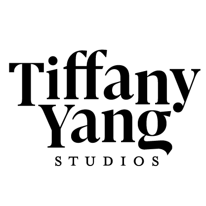
THE FINAL WORK
I started using my own name in my business about two years ago. The reason why I set out to do so is that I felt like my business is now more than just my blog (known as The Looking Glass back in the days). I spend my week doing everything and anything from photographing & styling, travel articles, features & interviews, and personal contents like product reviews. But it’s mostly still from my point of view, in a less subjective way. My logo will always be displayed in black text, but it wouldn’t be me if I didn’t have some fun with pink & nude. And Ann really did a fantastic job adding in my favourite colours. An arrangement that really goes with all the contents I produce. Very fun & modern. By the way, according to one of my closest friends when I showed him the final work, ‘this logo is SO YOU’. And honestly, what more can I ask for right?
大概學生時期開始寫部落格(主要原因是想練習拍照跟英文),以 THE LOOKING GLASS 為名,因為以前個性很害羞所以不太用自己的名字。還記得那時候當不太敢身邊的人知道,如果朋友看我的文章還會覺得非常尷尬(笑)等年紀大了些,經驗多了,才漸漸開始對分享這件事感到舒適。兩年前轉以自己的名字來進行書寫與影像創作,之所以這麼做,是因為在我看來,TIFFANY YANG 這兩字不單單只是代表我這個人,也能代表我的作品。或許攝影與撰稿是為了客戶或平台所給予的主題,但核心終究是我,只不過出發點客觀了些,而我,想以我的名字為傲,希望時間久了,有人看到這樣的文字與照片風格能立刻想到是我。在進行 REBRANDING 前,我就清楚知道我的名字將會以深色的顏色來展示,但如果不帶點粉裸色,似乎有點不像我。說到這裡真的得感謝 ANN,巧妙的運用了字體規劃,不管是LOGO本身還是名片都能與我的影像作品相互應。後記:結案後,我立刻把成品傳給一位認識很久的朋友,他說「這個LOGO很妳耶!」。噢,這不管是對我還是對設計師,都是最好的稱讚了吧!你們覺得呢?
follow Ann Chang & Me on Instagram
design images all by Ann Chang
mood images via Pinterest